

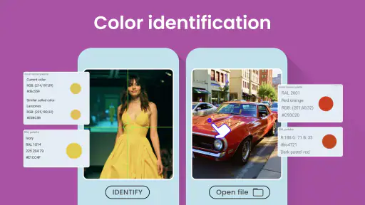
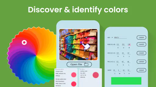
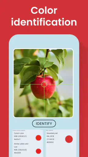
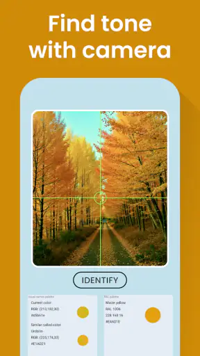
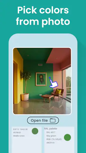
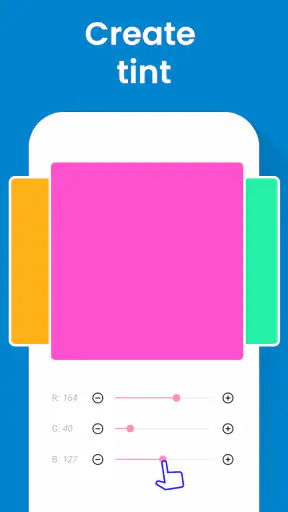
I often think of color as something obvious until I need to describe it accurately. A wall may look blue, a fabric may seem close to a particular shade, or a design sample may appear to match another screen, yet ordinary color names quickly become too vague. Color Identification is built for that small but surprisingly common problem. It is a free photography app from Galaxy studio apps that turns a color you point at into practical information: a name, an HTML color value, an RGB value, and a RAL code.
After using it, I see the app less as a photo editor and more as a pocket reference tool. Its purpose is narrow, which is both its appeal and its main limitation. You are not opening it to create a polished image, apply artistic filters, or organize a large photo library. You are opening it because you want to identify a color and receive codes that can be useful in design, decorating, crafts, printing discussions, or everyday shopping decisions.
The app has been available since April 22, 2018, and its current version is 48.1.3. It has passed one million installs and holds an average rating of 3.8 from roughly ten thousand ratings. Those figures suggest a tool with a substantial audience, although the rating also tells me to keep expectations realistic: this is useful utility software, not a perfect color-measuring instrument.
How I would decide whether Color Identification belongs on my phone
My first decision criterion is the kind of answer I need. If I only want to say “light green” or “warm gray,” the app may be more detailed than necessary. If I need a repeatable digital reference, however, the combination of a color name, HTML value, RGB code, and RAL code makes it more interesting than a basic color picker. Those outputs connect visual observation with the formats people actually use in websites, design programs, product discussions, and physical color catalogs.
The second criterion is convenience. A dedicated identifier can be quicker than opening a full image editor and searching through its tools. That matters when I am standing in a paint aisle, comparing a piece of clothing with a sample, or looking at a printed object that I want to discuss with someone else. The app’s value comes from reducing a vague visual judgment to a compact set of labels and codes.
The third criterion is accuracy in the situation where I plan to use the result. A phone camera does not see color in isolation. Room lighting, shadows, reflections, camera processing, screen brightness, and the surface itself all influence what the app receives. I treat its result as a practical estimate rather than laboratory-grade measurement. That distinction is important if the color will be used for a costly renovation, a manufacturing order, or a strict brand standard.
There is also a difference between identifying a digital color and identifying a physical object. On a screen, the displayed shade is already represented by digital values, but the appearance can vary between devices. On paper, wood, paint, plastic, or fabric, the camera is interpreting light reflected from a material. A result can therefore be helpful without being an exact promise that two physical objects will match.
The information it gives me is more useful than a simple color name
The plain-language name is the easiest part to understand, especially when I need to explain a shade to another person. The HTML value is more relevant when I am working on a website or digital mock-up. RGB is familiar to anyone using creative software or discussing screen colors. The RAL code is particularly useful when a conversation involves physical color standards, although I would still compare the code with a real-world sample before committing to a purchase.
One practical habit is to write down all four outputs instead of saving only the name. Names can be subjective and may vary between tools, while codes give me something more precise to pass to a designer, decorator, developer, or supplier. I find the combination more valuable than any single result because it lets different people approach the same shade from their preferred system.
A second useful habit is to identify the surrounding context, not only the target object. If I am checking a wall, I would sample a clean area away from a corner, strong shadow, glossy reflection, or nearby colored object. If I am checking fabric, I would flatten it and avoid folds. These steps are not special app features, but they make the app’s output much more dependable.
Where the focused design works especially well
Color Identification makes the most sense for quick, one-off decisions. Imagine that I am trying to replace a cushion, notebook, curtain, or accessory and want to get closer to an existing color. I can inspect the item I already own, note the suggested values, and use them as a conversation aid while shopping. I would not expect the result to guarantee a perfect match, but it can narrow a frustrating search.
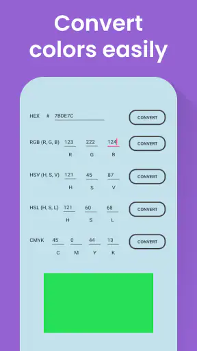
It is also a handy bridge between physical inspiration and digital work. I might see a color in a poster, package, room, or landscape and want to use a similar shade in a presentation or website. Rather than guessing by eye inside a design program, I can start with the app’s RGB or HTML result and adjust from there. That workflow is faster than trying to recreate the shade from memory.
For students and beginners, the app can make color systems less abstract. Seeing a familiar object connected to a name, a digital code, and a RAL reference helps explain that “color” is not just a word; it can be described through several different standards. I would use it as a learning aid, especially when comparing how a color is represented for screens versus physical materials.
Its Everyone content rating also makes it suitable for ordinary household use without presenting itself as a specialist-only tool. The free entry point helps too. I can install it for a particular project without first committing to a subscription. In-app purchases range from $0.49 to $99.99 per item, so I would check the purchase screen carefully before paying for anything. The basic appeal of the app is strongest when I can use its central identification task without turning a simple question into a larger expense.
Small workflow choices that improve the result
The biggest improvement comes from controlling the light. I would avoid sampling under a strongly colored lamp or beside a bright window that creates uneven illumination. Daylight can still change throughout the day, but it is generally easier to judge than a room lit by a colored bulb. If the object is glossy, I would tilt it slightly so the camera does not capture a bright reflection instead of the surface color.
I would also take more than one reading when the decision matters. A single point can land on a highlight, texture, or tiny variation. Checking several nearby areas and looking for a consistent result gives me more confidence than accepting the first value immediately. If the readings vary significantly, that is useful information in itself: the surface or lighting may be too inconsistent for a reliable identification.
Another non-obvious tip is to keep the phone’s screen and the physical sample in the same visual context when comparing them. Looking at a code on a bright screen and then walking into a dim room can make the difference seem larger or smaller than it really is. I would use the app to create a reference, then compare the actual materials under the lighting where they will be used.
For digital work, I would treat the HTML and RGB values as a starting point rather than a final design decision. After entering the value into a design tool, I would check contrast, accessibility, and how the shade sits beside neighboring colors. Identification answers “what is this close to?” It does not answer whether the color combination is readable or visually balanced.
When another kind of tool may be the better choice
The usual alternatives fall into several categories, and each solves a different problem. A full photo editor is better when I need to sample a color from an existing image, refine a selection, correct lighting, or build a complete design. A web-based color picker may be more convenient when the source is already on a computer screen. A physical color fan or manufacturer sample is the safer choice when the final decision concerns paint, fabric, coatings, or production.
I would choose a general-purpose design app if color identification is only one step in a larger project. Moving between an identifier and an editor can become inefficient when I need to crop, retouch, compare palettes, or save a series of variations. Color Identification wins when the question is focused and immediate; it loses when I need a complete creative workspace.
For professional color matching, I would be cautious about relying on a phone alone. A calibrated camera workflow, controlled lighting, and physical standards are more appropriate when a small mismatch could create waste or financial loss. The RAL result is useful as a reference, but I would not treat it as a substitute for checking the actual RAL sample. The app can help me communicate a target; it does not remove the need for professional verification.
There is a similar limitation with screens. If I identify a color from one phone and reproduce it on another device, the two displays may not show exactly the same shade. The HTML and RGB codes are still useful because they describe the intended digital value, but the visible result depends on the screen and its settings. Anyone choosing colors for a website should inspect the final design on more than one display and consider contrast for readability.
I would also skip this app if I want a broad photography experience. It is listed in the Photography category, but its role is identification rather than editing, sharing, or managing photos. Someone searching for filters, portrait tools, collage creation, or camera controls should look elsewhere. Installing it for those purposes would create disappointment because its strength comes from doing one specific job.
What switching away would involve
The cost of switching is mostly about workflow rather than learning. If I move to a full editor, I may gain more control but spend longer finding the correct sampling tool and navigating a larger interface. If I switch to a physical reference system, I gain confidence for material matching but lose the speed and portability of a phone-based estimate. If I use a browser tool, I may work more comfortably on a large screen but cannot inspect a physical object as conveniently.
That makes Color Identification a good companion even when it is not my final authority. I can use it to narrow down a shade, record the codes, and then confirm the choice in the tool suited to the project. For example, I might identify a wall color at home, use the result to search a retailer’s catalog, and finally compare a sample card under the room’s actual lighting. The app saves the first step without pretending to replace the rest.
One thing I would watch is the app’s ongoing fit with my phone. It requires Android 8.1 or later, so compatibility matters on older devices. If the app installs and opens normally, the focused workflow is easy to understand, but people using an older phone should check that requirement before planning around it. The current version is 48.1.3, which is relevant when checking whether the installed copy is up to date.
The developer, Galaxy studio apps, has kept the product centered on a straightforward identification concept. I appreciate that focus because I do not need to learn a complicated creative system to get a useful reference. At the same time, a focused app gives me fewer ways to recover when the initial sample is poor. Good lighting and careful positioning remain part of the process.
My recommendation depends on the size of the decision
I recommend Color Identification to anyone who regularly needs a quick bridge between visible colors and usable codes. It is especially suitable for hobby designers, students, home decorators, crafters, developers choosing a starting palette, and shoppers trying to describe a shade more clearly. The free price makes it easy to test, while the Everyone rating keeps it approachable for general users.
I would recommend it less strongly for professional production matching, expensive paint decisions, or any job where a small color error has serious consequences. In those situations, I would use the app for preliminary communication only and confirm the result with a physical standard or a controlled measurement process. That is not a flaw unique to this app; it is a limitation of using a phone camera to interpret real-world color.
The average rating of 3.8 shows a mixed but reasonably positive reception. I read that as a reason to value the app for what it actually does rather than expecting flawless recognition in every environment. Its million-plus installs indicate that the simple idea has practical appeal, but popularity does not change the need to check lighting, surface texture, and display differences.
My final view is that Color Identification is best understood as a fast color reference, not a precision instrument. I would keep it installed for those moments when “blue,” “beige,” or “almost the same” is not enough. The name, HTML, RGB, and RAL outputs give me several useful ways to continue the task, and the app is quicker than opening a heavyweight editor for a single question.
If your goal is a quick, portable estimate that helps you communicate a color, I think it is worth trying. If your goal is guaranteed physical matching or full-scale photo and design work, choose a more specialized alternative and use this app only as an early step. That clear boundary is what makes the tool useful: it does not need to do everything, provided I ask it to solve the right problem.


